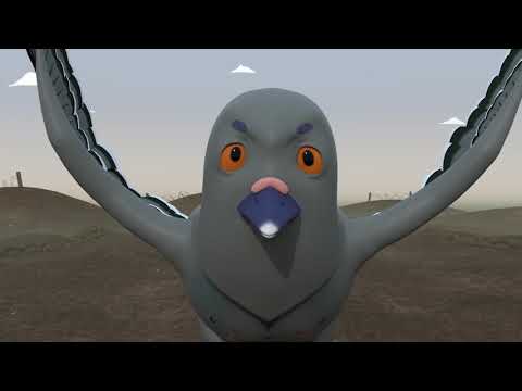
Version 1
Version 2
This is the second idea I had for concept art, influenced by some Victorian posters of magicians. I have two versions because I wasn't sure about the placement of the words. I'm leaning towards the first version because it's easier to read, but if anyone has any opinions on which one please comment.


I think version 1 fits in much better!
ReplyDelete