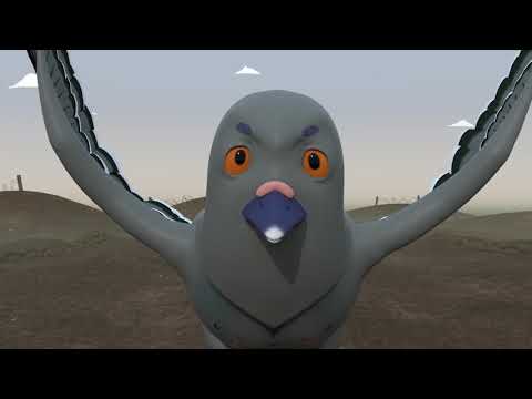
Today we looked at animation and layout. Justin started the lesson by showing us examples of layouts and how they use perspective. We then spent the day figuring out the layout of our environments and
getting an idea of what they would look like when we change the perspective.
This was my first attempt, but the perspective I drew the stage in was a bit extreme and didn't look believable. The figure next to the stage was me just trying to play around with the perspective of the character. I used 3 point perspective for this to make the character look big and grand. I didn't spend too much time on it though since I needed to focus on the environment.
After Justin gave me some advice based on the first drawing, I went and drew out the environment again. I'm happy with the outcome, some of the perspectives need to be fixed but overall I'm pleased with the layout.
(Layout sketches)


No comments:
Post a Comment