Tuesday, 31 October 2017
Monday, 30 October 2017
What if? Metropolis Thumbnails 21-35
These are some more generic thumbnails based on shapes I saw in my artists work. The thumbnails I produce from now will match more to my travelogue.
What if? Metropolis thumbnails 1-20
These first few thumbnails are simple and generic ones to try and spark some developmental ideas later on. I also plan on doing more thumbnails that match closer to the Travelogue.
What if? Metropolis - Travelogue
This is a draft of my travelogue, I plan on reading over it a few times to see if I can improve it. I will have a name for the city by the time I post my OGR but for now I'm still thinking. Also, any suggestions for where I can improve are more than welcome.
The city of (insert name) would make you believe that you have
entered a winter wonderland, with the snow crunching under the feet of those
who walk up to the city and covering anything and everything in sight. The
surrounding area of the city sometimes looks as though it has been erased
because how thick the snow can be, like a blank sheet of paper. The
(inhabitants name) are aware that it can be difficult to find (city name)
and have lamps leading along a path to the city, so on days of heavy snowfall travellers
are still able to find way.
The paved roads around this part of the city are red with
strange stained looking patterns on them, which then stop after a certain
point. Buildings are geometrically shaped on one side of the city, with bright
colours all over with some being complimented by white. Some of these shapes
that make up the buildings might have visitors question how people live in such
strange and unique buildings. This side of the city seems to be more free and
relaxing for visitors, despite the snow and has a welcoming atmosphere. In
spite of the gracious geometric buildings and sense of freedom and community,
this side of the city seemed to be frowned upon. When you look closely through
the snowy winds stand there is huge towers that look down on the happy little
community.
You can only walk so far into (city name) before you realize
the divide that is within it, which becomes clearer once you reach the bridge
separating the districts. The first part of the city that you are greeted by is
considered the "workers district", which is why THEY frown upon them.
Leaving the cold yet warming district of workers, you'll start to somehow feel
colder and notice that it has gotten darker. Looking up there is a huge
towering building and you're standing in its shadow. These buildings are in the
“ruling district”, those who believe that because of their wealth they are
above those in the “workers district” and view them as peasants. Their mind set
of those in the "workers district" lead to the creation of the
enormous metropolis that towers over the district below. The buildings are made
of concrete with a lot duller colours than are used in the district below. This
district will spin visitors on their heads with the contrast in the atmosphere.
the streets seem to be near enough empty all the time except the odd shopper,
but you can't shake the feeling that you're being watched, judged for not
living a silver spoon lifestyle.
However, no matter how hard the "ruling district" tries
to disassociate themselves from the workers they are all inhabitants of the
same city. There are a lot of differences between the two districts from the
experiences of the people, structures in the districts, the care and attention
that workers put into their district compared to those in the "ruling
district" and the atmospheres they want to create. On the other hand,
these two do both have some similarities but the most important one is their
love for the arts. Obviously they have different tastes but they are both
passionate about it which comes across in the architecture of the buildings.
Both districts have their own iconic buildings in them, for
example the workers have an immaculate community building which received the
most attention and care. The know how important community is in maintaining a
stable being, so they use this building the most as if it were a church or
cathedral. The community building is for everyone of course, there is no
exception to age and lets the adults relax from working all day. Similarly to
the rest of the building in the district this one is very geometric and is the
biggest building there. It has several triangular shapes that make up the
rooftop and then the base of the building is pentagon shaped with additional
geometric shapes to provide more room for others. while the adults talk and
discuss the day, children can play inside or outside and build snowmen.
The "ruling district" also has their own iconic
building(s) which can be found in the commercial junction in the middle of the
district. On the buildings there are huge monitors mounted to them as well as
billboards with propaganda on them. Down from the streets the propaganda looks
near god like because of the scale of the buildings and billboards, as if it
were the words of god himself. Even though workers can visit the "ruling
district" to shop and get to work, the residents of the "ruling
district" aren't afraid to show their ideology through the propaganda. In
the past they have caused conflict with the workers since they disagree with
this ideology, but since the workers don't have the same level of power it only
ends badly.
The bridge that separates the districts leads to a small port in the
"ruling district" this way imported goods can be stocked in the shops
easier. The most common items imported to (city name) are; fresh fruits,
vegetables and meat. The freezing conditions can make it difficult to grow and
farm essentials so most are imported. The workers that don't work in the
"ruling district" come to the ports to get supplies for their stalls
in the "working district". Due to the cold weather a lot of the water
is frozen but because of the boats that export goods the water around the port
isn't frozen.
Despite the clear segregation and cold weather, there
is a short period of time in (city name) where the snow melts and the sun
shines. During this time the workers hold a festival called the “red festival”.
The workers take to the streets to watch the marching band and watch other
celebrations such as the feast, drinking, other music as well as the big draw.
The big draw is when massive rolls of paper are rolled out and everyone grabs
whatever materials they want and draw. Sometimes residents from the “ruling
district” will come to the festival to join in. However, a large majority of
the “ruling district” disagree with this a look down on those who actually join
in, for a brief moment in time the two districts put aside their history and
come together and enjoy themselves.
Thursday, 26 October 2017
What if? Metropolis - Influence Map
I started by looking at Rodchenko's artwork try to generate ideas. I then had the idea of possibly using elements of St Petersburg in my thumbnails. Also I looked at images of snowfall in St Petersburg because I associate Russia with snow and thought it would be an interesting feature to add.
What if? Metropolis - Artist Research
Alexander Rodchenko
- Russian artist, photographer and graphic designer
- Founder of Constructivism and Russian design
- Married Varvara Stepanova (Artist)
- Born in St. Petersburg to a working class family
- Drew inspiration from art magazines
- Studied under Nicolai Frenchin and Georgii Medvedev
- First abstract painting influenced by the superematism (art movement)
- His work is heavily influenced by cubism and futurism
- Geometric forms against a white background
- Impressed by Photomontage by German Dadaists
- First Photomontage illustrated Mayakovsky’s poem
- Key features in his images: they eliminate unnecessary detail, emphasize dynamic diagonal composition, and were concerned with the placement and movement of objects in space.
- Committed to the Russian revolution
- This lead to him abandoning painting and working on advertising campaigns with Mayakovsky
I plan on doing more in depth research about Rodchenko, but for the moment this is my starting point.
Monday, 23 October 2017
Reflective Statement
I struggled with my Invisible Cities project with both the thumbnails and digital painting, but the skills and techniques I learned made the experience worthwhile. I learned how to thumbnail in a more efficient way, rather than spending too much time on one I should focus on generating ideas. Also, I learned useful Photoshop techniques such as layer modes that helped with the concept art for my city. I feel that even though my initial thumbnails for Zenobia were not that strong conceptually, I still managed to achieve a confident outcome. What I would like to improve for next time is my time management, I didn't focus enough on certain days. This resulted in me having to rush a few things near the end, which could have been avoided.
Thursday, 19 October 2017
Monday, 16 October 2017
Friday, 13 October 2017
Tuesday, 10 October 2017
@Phil Invisible Cities - Zenobia concept drawings
In my previous drawings for Zenobia I had drawn it as more of a village rather than a city.
In these drawings I tried to make my version look more like a city as well as doing some
research into possible things you might find in Zenobia. Based on my research I found that
there are a range of bamboo objects that I can include in my interior or exterior such as; instruments,
weapons, furniture, fishing rods, bicycles, bamboo cannon (firecracker), and possibly a glider for
aerial transport.
Monday, 9 October 2017
Space Odditie: King Kong
Coming into this film having a vague idea of what to expect (racism and sexism) and only seeing the modern day adaptations it's hard to actually know whether it's going to be received positively or negatively. In Merian C. Copper and Ernest B Schoedsack's King Kong (1933) the themes of racism and sexism are very prominent, but do not overshadow the stop-motion animation and special effects which at the time were something to behold.

(fig. 2)
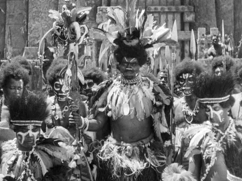
Nowadays the film's racism and sexism is much more obvious as society has focused more on the equality of people, regardless of race or sex. None the less, the representation of the islanders shows the depiction of black people at the time. Once Carl Denham and his crew arrive at the island they see the islanders, who are represented in a stereotypical way; they are seen dancing around a fire wearing loincloths, wearing coconut bras and committing human sacrifices to a god they believe will punish them if they don't. This is further supported by Jordan Zakarin (2017) who looks at how Kong has gone from being a "racist monster" to "woke hero": "Those villagers are the worst kind of stereotype [...] It is, by today’s standards, ridiculously racist".
(fig.3)
As well as the racism within the film, it's also very sexist. One of the main purposes of Ann Darrow as a character was to be represented as a sexual object. An example of sexism in the film can be seen when the villagers of the island want to trade six of their women for Ann. This can link back to the racism in the film implying that a single white woman holds more value than six black women. However, the focus of mentioning that scene was to draw attention to the fact that the men believed that they had the right to trade women off like they were a possession. Furthermore, throughout the whole film Ann is portrayed as a weak and defenseless character, spending most of her time screaming and having to be rescued by men. This is further supported by Gumtow et al, " She doesn't seem to have any power or any purpose other than to be a sexual object." Although these two themes that come up in the film are disrespectful and demeaning, it does not ruin the whole experience of the film. Considering the time period, these themes are almost expected. As a result the audience may look over them and choose to focus on the other elements of the film including the fight scenes, closing moments of the film and the revolutionary special effects.
Lastly, the special effects and stop-motion animation were revolutionary for future films such as 'Jurassic Park' and 'Alien'. In comparison to today's standards of special effects and animation King Kong would definitely fall flat, but at the same time it's in a league of its own. This can be further explained by Dabell's (2004)point "the special effects obviously look rather primitive to 21st Century eyes - but anyone with a shred of common sense will still be astounded by what they see." Although, the special effects aren't as high quality, the film gets the viewer thinking about how it was possible to make this beast and the island it lives on.
Overall, it may not be the best film and uncomfortable at times, but it is definitely is key to other successful films as well as still being able to amaze people with its special effects and animation for the time it was made.
Bibliography:
zakarin: https://www.inverse.com/article/28860-king-kong-skull-island-politics-racism
Gumtow:http://kingkongkingdom.weebly.com/
dabell: http://www.imdb.com/title/tt0024216/reviews?ref_=tt_urv
Illustration:
figure 1: http://www.classic-monsters.com/shop/product/king-kong-1933-ultimate-guide/
figure 2: http://www.alleycatscratch.com/movie/kong/1933/Natives.htm
figure 3: http://snarkymoviereviews.com/king-kong-1933/
Saturday, 7 October 2017
Space Oddities: Metropolis

This review will be looking at Fritz Lang's "Metropolis" (1927). The Germany expressionist film marks the beginning of the science-fiction genre in film. As well as that though "Metropolis" also has sub-genre within it too such as; horror, romance and disaster. The film is also meant to be social commentary of Germany at the time and elements of that can still be found in society today.
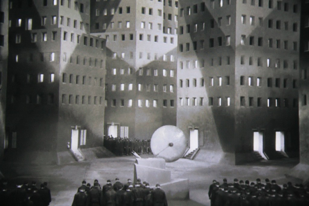
The film shows a few themes that are still relevant in society today those are; the struggle between the proletariat and the bourgeoisie, religion as an escape from difficult times and the portrayal of woman. The most obvious one of the three listed is the class divide in the film, where the working class aren't just separated by economic means but also they have their own city that is under the metropolis.
(fig. 2)
Linking to the the theme of using religion as a means to escape hard times, there is a scene in the film where all the workers gather in an underground cave that also looked like a church that had huge crosses in the background. Malinowski (1954) studied how in stressful times religion provides psychological stability, which seems to be what the workers are doing by gathering to listen to Maria preach. She talks about a mediator, which gives the workers hope that the mediator will appear and change the class divide.(fig.3)
Also, the portrayal of woman in the film or more specifically Maria. At the beginning of the film Maria is portrayed as a saint to all the workers as she gives them hope and then later on the worker can't distinguish the real Maria from the machine one, which is understandable since they look identical. However, it's the fact that once the workers realise they left their children they blamed Maria, which is also understandable but they do not take any responsibility themselves. Obviously, the evil version of Maria was at fault but it seemed that the workers didn't think for themselves or take any responsibility. This can be linked to the idea that "women are takers of shit" (Ansley 1972), which is how the scene felt when all the workers were chasing Maria to take their frustration out on her.
As well as the social commentary, the film has amazing special effects and set design for the time. Only 7 years apart from Des Cabinet Das Dr Caligari (1920) and the progression in set design and special effects is very clear. The film has a few iconic scenes that demonstrate this well, that being; the flood scene, the transformation scene, and the scene where the worker causes an explosion and the machine temporarily turns into a monster. These are prominent scene that are memorable to most viewers, "The models of the city's towering skyscrapers are also surprisingly convincing for a 1920s film [...] special effects, Lang's visuals are all consistently inventive" (Jones 2005). These scenes contain well detailed miniatures, multiple exposures for the transformation and the models used to create a real life city feel.
Bibliography:
Malinowski (1954) - https://www.slideshare.net/lil-slide-share/functionalist-theories-of-religion
Ansley (1972) - https://www.slideshare.net/guest0e466c/sociologists
Jones (2005) - http://www.imdb.com/title/tt0017136/reviews?ref_=tt_urv
Illustration:
Figure 1 - http://tvtropes.org/pmwiki/pmwiki.php/Film/Metropolis
Figure 2 - https://laurenwinter.co/blog/urenwinter.co/2012/01/metropolis.html
Figure 3 - https://www.thinglink.com/scene/446806896448372737
Wednesday, 4 October 2017
Tuesday, 3 October 2017
Subscribe to:
Comments (Atom)


